THE PROBLEM:
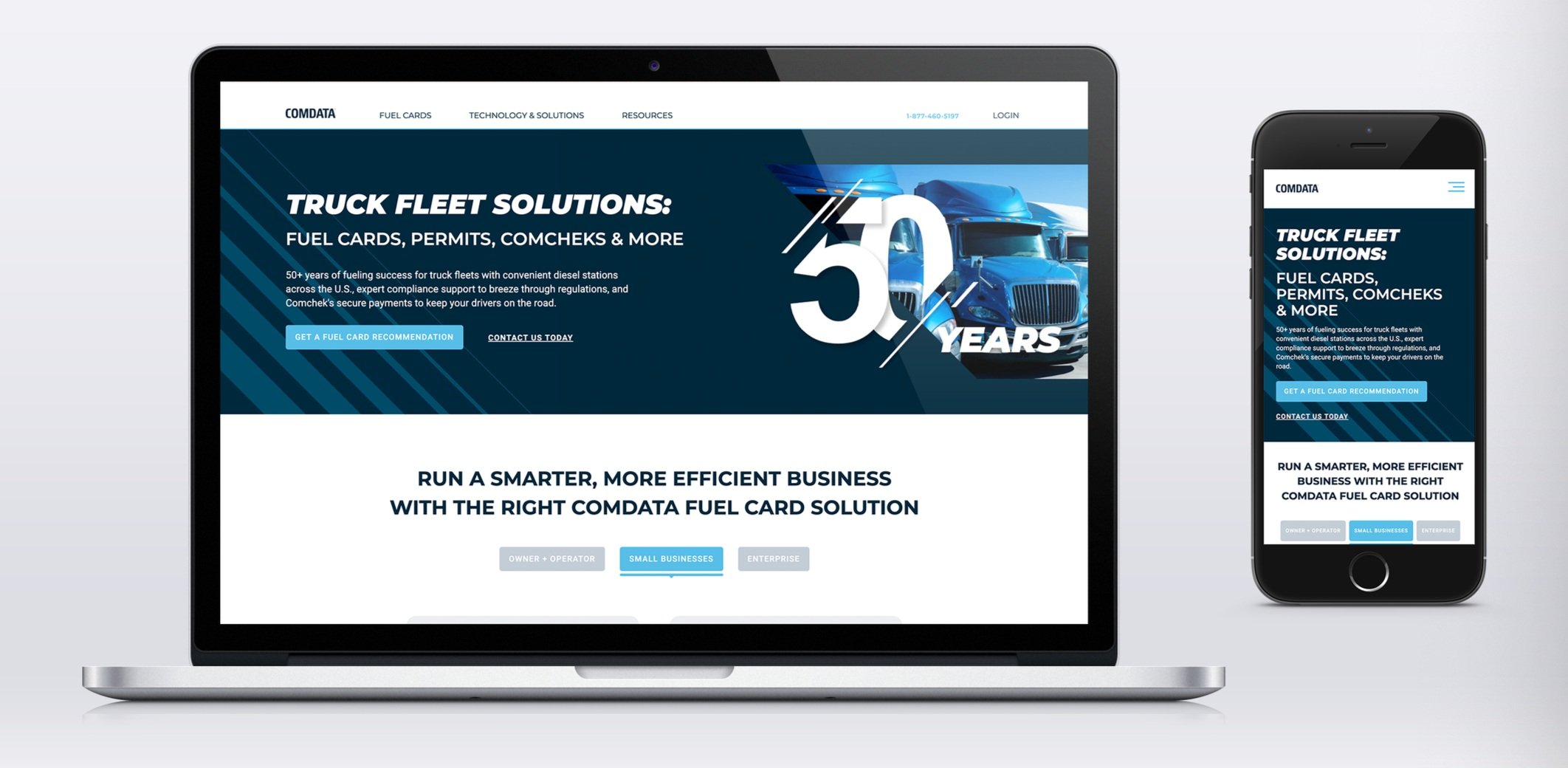
Comdata needs a homepage overhaul that is more up to date, clean, and competitive with their market.
What we know:
Fleet truck drivers are very familiar with the Comdata brand.
It has been around for 50+ years making it one of the most trusted fleet card brands in the market
Hypothesis:
Most people going to the homepage are looking for guidance on applying for a fleet management card.
Methodology used:
Competitive Analysis
Wireframes
Sitemap / Navigation updates
Usability Scripting
User interviews (moderated and unmoderated)
Brand refresh (colors, fonts, imagery)
Organization of content / Information Architecture
Iterative design based on user feedback
METHODOLOGY & CONSIDERATIONS
COMPETITIVE ANALYSIS
We analyzed the design & UX choices of several competitors in the market.
WIREFRAMES
Working with other business stakeholders, coming up with the best way to present all the information we have to the user in the best, most cohesive way possible.
High Fidelity Designs
Using the brand guidelines, I created all assets and interactions for the responsive site, including a brand new navigation mega menu.
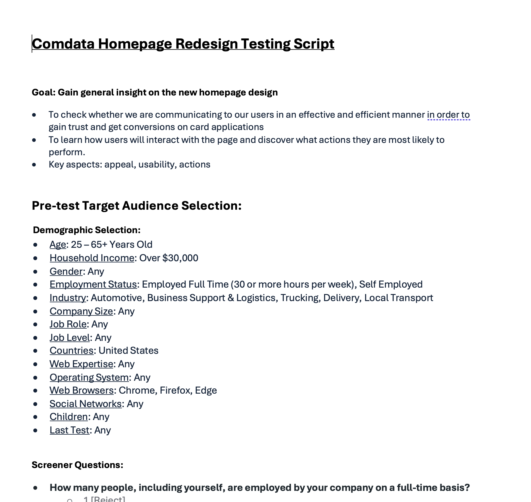
Usability Testing Scripts
Once the design and prototypes were created, I created usability testing scripts based on what information we are trying to gather from the market and how our website is performing. We conducted 10 mobile interviews and 5 desktop moderated interviews.
USER TESTING
We conducted 10 unmoderated mobile interviews and 5 desktop moderated interviews.
Design iterations
After learning more about our users, we did some design iterations and moved to A/B testing.


